Post by @fasnix

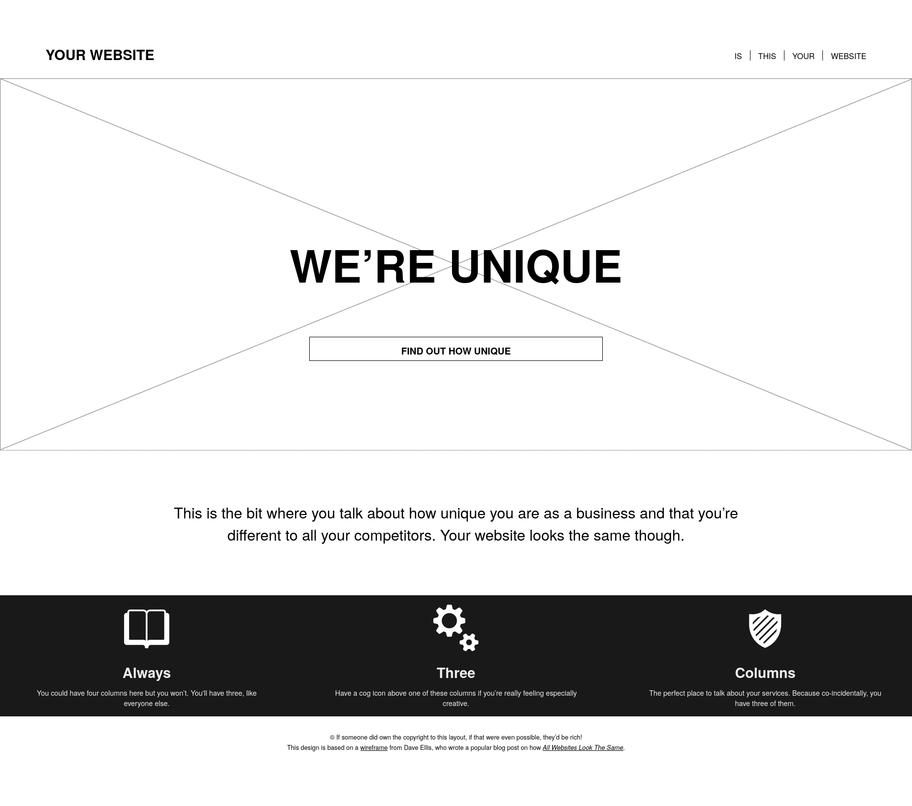
It is said that ai generated websites would all look the same.
Well, like @jensimmons@front-end.social pointed out already in 2017 is that indeed many business websites looked the same anyway:
- logo top left
- horizontal navigation
- big "hero"-image beneath
- large introduction with a "call to action"-button above the fold
- three columns for the most important things to point out
- and so on.
So unique, isn't it?
And nowadays?
Even without the rise of ai generated websites this trend only got going, as this layout is the mostly used on the internet.
The "commercialised internet" developed speficic conventions and shaped user expectations, like e.g. for onlineshops:
- logo top left or centered
- search bar top center or right
- user navigation top right (like profile, basket)
- product image(s) on the left, "buy"-button right
- and much more.
And we, as users, are deeply conditioned to these layouts.
So, what's the big deal, if ai generated websites "all look the same"?
Isn't all just a remix anyways?

@fasnix @jensimmons Yup, in many cases AI just continues and exacerbates existing trends. I hate this kind of website, and most of all the "hero" image. Such a waste of screen estate and transfer bandwidth.
@drmabuese@social.tchncs.de
That's why I want to offer a niche with "small and fast websites".
See my post from earlier today ("Testlesende gesucht").