Post by @shom

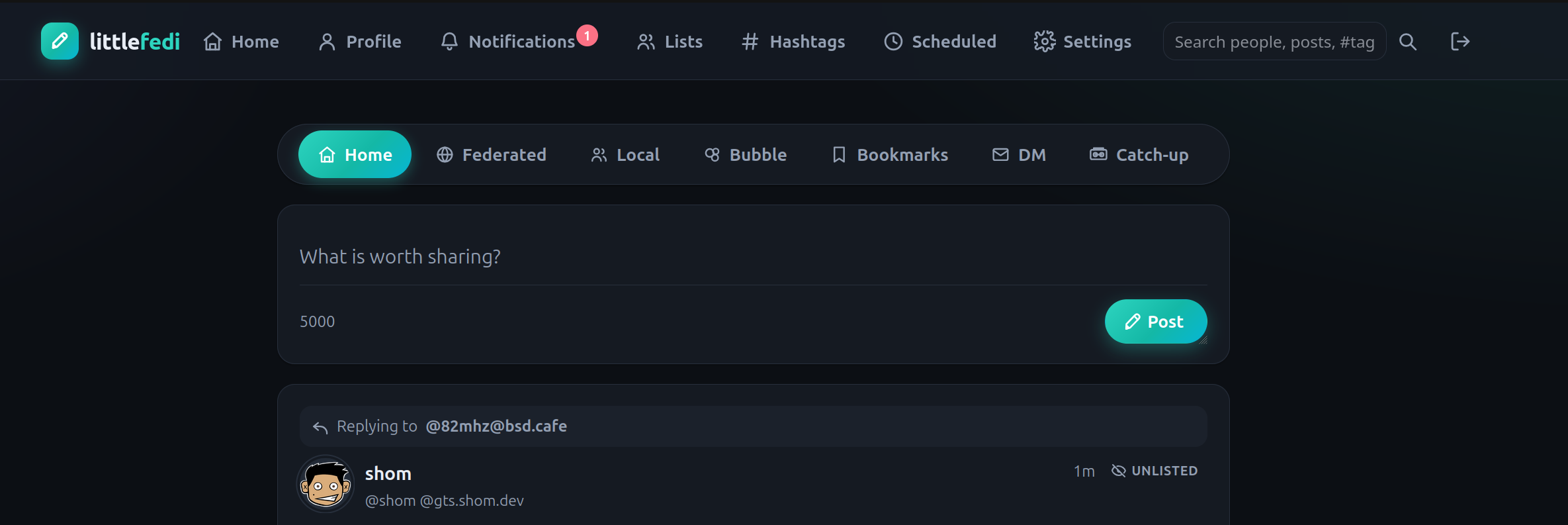
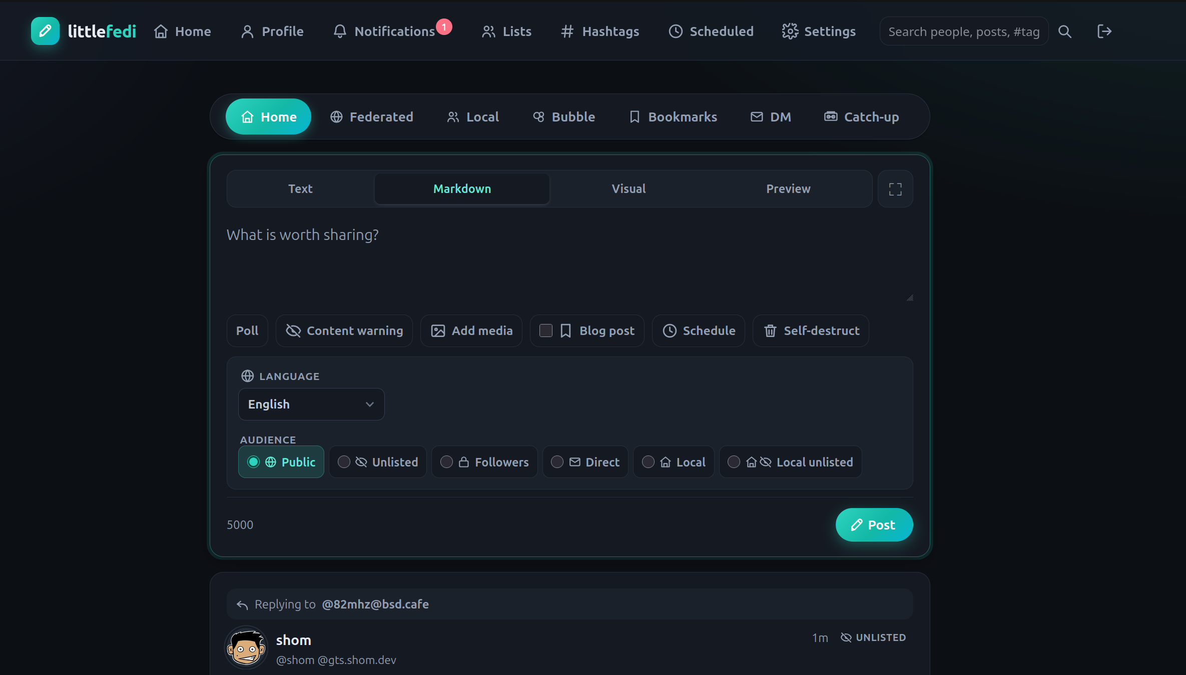
Hey @stefano following up from my earlier comment with some quick edits from the DOM inspector. These are some UI/UX suggestions and why I'm making the suggestion. I hope this isn't over stepping and happy to take guidance on what kind of feedback you'd prefer instead.
Changes shown and why:
- The default width increased from 720 to 800 to prevent overflow of Catch-up into separate line and 800 is a reasonable expectation for width for contemporary viewports.
- Both of the screenshots show #littleFedi interface with timeline-nav moved above composer.
- When a new user comes to the home timeline they don't see all the awesome post options, wonderful as they are, they are numerous and intimidating.
- However, when they click into updating the status the options are revealed to them. This follows existing paradigm of clicking Poll / Content Warning / Schedule / Self Destruct which reveal relevant options when clicked.
In writing this up I also discovered a quirk with the Visual Editor, there's no mechanism to make a nested bulleted list. I switched to markdown to indent the list level and it works fine when doing that, it also handles traversing up the bullet hierarchy via backspacing as expected from other editors.
Happy to expand on anything I explained poorly! Also, you/team have been putting in some Herculean efforts with the updates, I hope there are scheduled naps 💛
Cheers!